How can I help you?
I support you in all phases of the graphic creation and either take over or advise. So I can help exactly where you need it: from selective support to an all-round package. Regardless of whether the concept is only to be created and the graphic implementation is carried out by you, or whether a graphic designed by you needs some final improvement – just ask me!
Science in - illustration out. My workflow.
In my illustrations, the focus is on the scientific statements. That’s why I start right there: with science. That means I start a lot earlier in the process than a graphic designer would.
Would you like an example? This is how the creation of a graphical abstract for a network proposal looked like:

Step 1: Understanding the science
What is the focus of the content? What are sideshows?
From which point of view do we want to look at the whole thing?
What are the key messages?
What background information is essential for the reader?
What prior knowledge can we assume on the reader’s side?
Result: I understood the project.
In addition to the written application and a conversation, another short conversation and / or email contact is often necessary. Because I ask until I understand everything. This is the only way we can be sure that everything essential is taken into account for the next step. A positive side effect: I check the application for clarity. If there were misunderstandings and ambiguities with me, it is worth taking another closer look and revising the text if necessary.

Step 2: Creating meaningful units.
In which subject blocks can the project be divided?
In what order are these blocks best presented?
Where are the connections between the individual blocks?
Result: a visual structure, a concept.
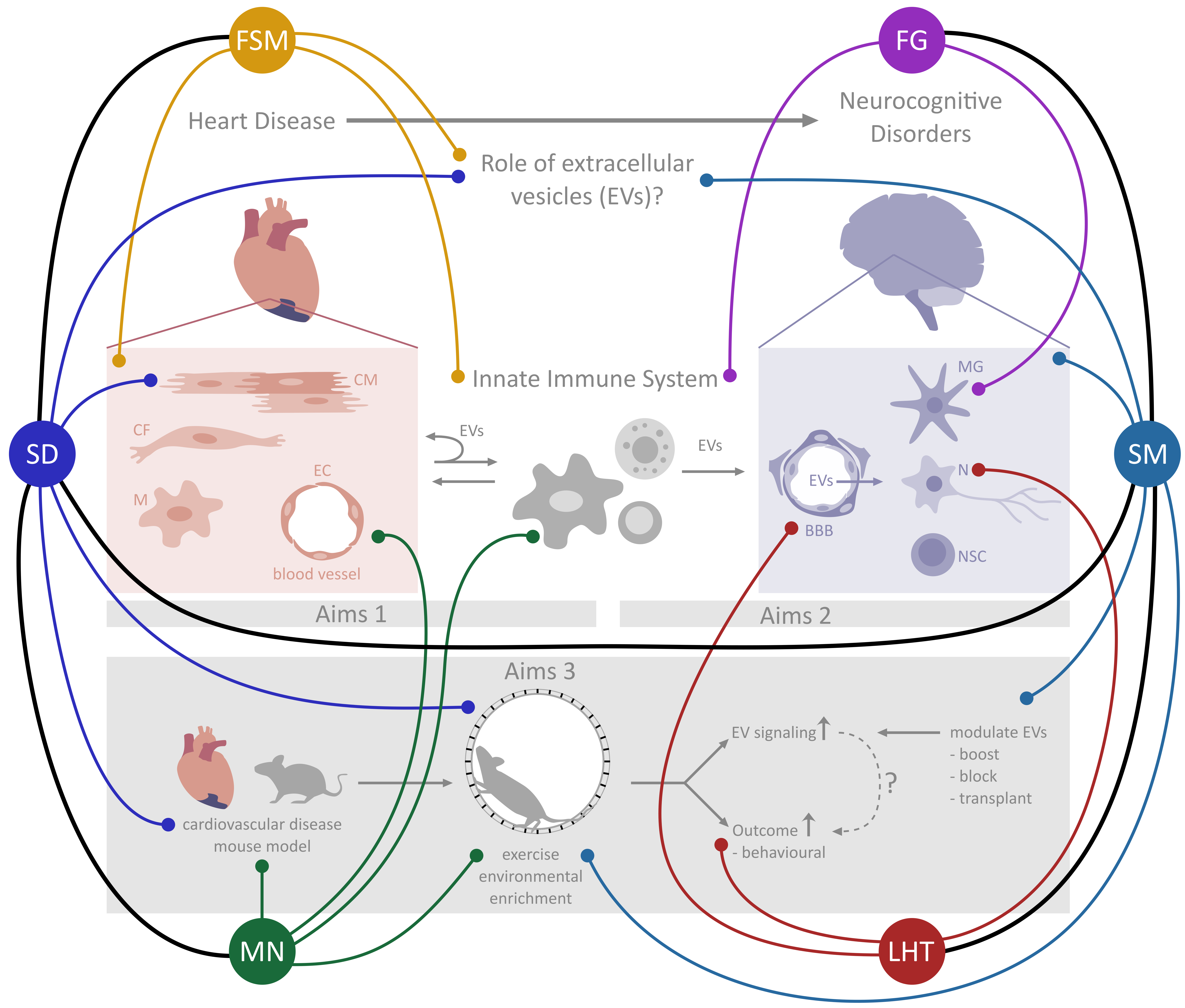
Details: There are two superordinate levels. On the one hand the content of the project, on the other hand the network of researchers and their expertise. In terms of content, the project can again be divided into three blocks, which pursue aims 1 – 3.
I use visual thinking to create the concept: I sketch the blocks, draw connecting lines and arrows. I scribble, doodle and fill page after page. Until the result shows a clear and meaningful structure of the project.

Step 3: Illustrating the abstract.
What is represented graphically, what only as text?
How can abstract terms be visualized in an understandable way?
Specifically: which picture is suitable for which term, e.g. “cardiovascular disease”?
How do we represent “endurance training in a mouse model”?
Result: a detailed sketch of what is shown and how.
Here, too, I am a scientist at heart: I don’t just draw somehow, but ask or see how it is correct. What does a mouse heart look like? Where exactly does a ligand bind? Visualization requires a higher degree of precision than words.
Step 4: Using graphic design in a targeted manner.
Where should the visual focus be?
How do I emphasize the outline and create a visual hierarchy?
How and for what do I use visual layers?
What is color used for? Which colors?
The result: a digital graphic that clearly explains science.
I work with graphic design elements to emphasize the message and structure of the graphical abstract. In particular, I use color very specifically and sparingly, because if it isn’t just supposed to be an eye-catcher, not everything should be colorful.
In this case I made a conscious use of color in two ways. On the one hand, to separate the block “Aims 1” (in delicate red tones on the left) from “Aims 2” (in light blue tones on the right) and to support the structure. On the other hand, to create visual levels. The network of researchers seems to float above the scientific content. As a result, the network is visually separated from the scientific content, although they overlap on the surface. This separation into two levels can only be achieved through a very careful choice of colors. It is crucial here to make the image appear orderly despite the abundance of information.
Because for me it is about more than beautiful pictures; it’s about the science behind it!